ESMA

Discovering what’s possible

Overview

ESMA (Employer's Social Mobility Alliance) was a pro bono project from Red Badger and consisted of a responsive content website. The main aim of the website was to inform people about issues faced by those from low-income backgrounds entering the workforce. Ultimately, highlighting steps people can take to help educate others and to promote collaboration between employers.

The team

The team consisted of a technical director, a tech lead, and myself as the sole UX Designer. The rest of the team included Barry Murphy and Barry Mathews, the co-founders of ESMA who were our main stakeholders. Our secondary stakeholder came from a research group called The Bridge Group. The Bridge Group was in charge of synthesising data from government websites, articles, and reports on social inequality, so the users of the new website can easily read the material.

My role was to run the client through the discovery process, tailoring sessions to suit their needs and focusing on the first part of the double diamond process (discovering and converging). After the discovery phase was complete, I was to roll off the project, documenting the results for another team to pick up and complete the rest of the build.

The problem

The client came to Red Badger with little knowledge of agile methodologies, design thinking, and design processes. The client knew they needed a website, but didn’t know the steps to get to the result. The main areas of concern were the level of education we would need to provide to the client and making sure they saw value in all the activities we had planned.

Goals

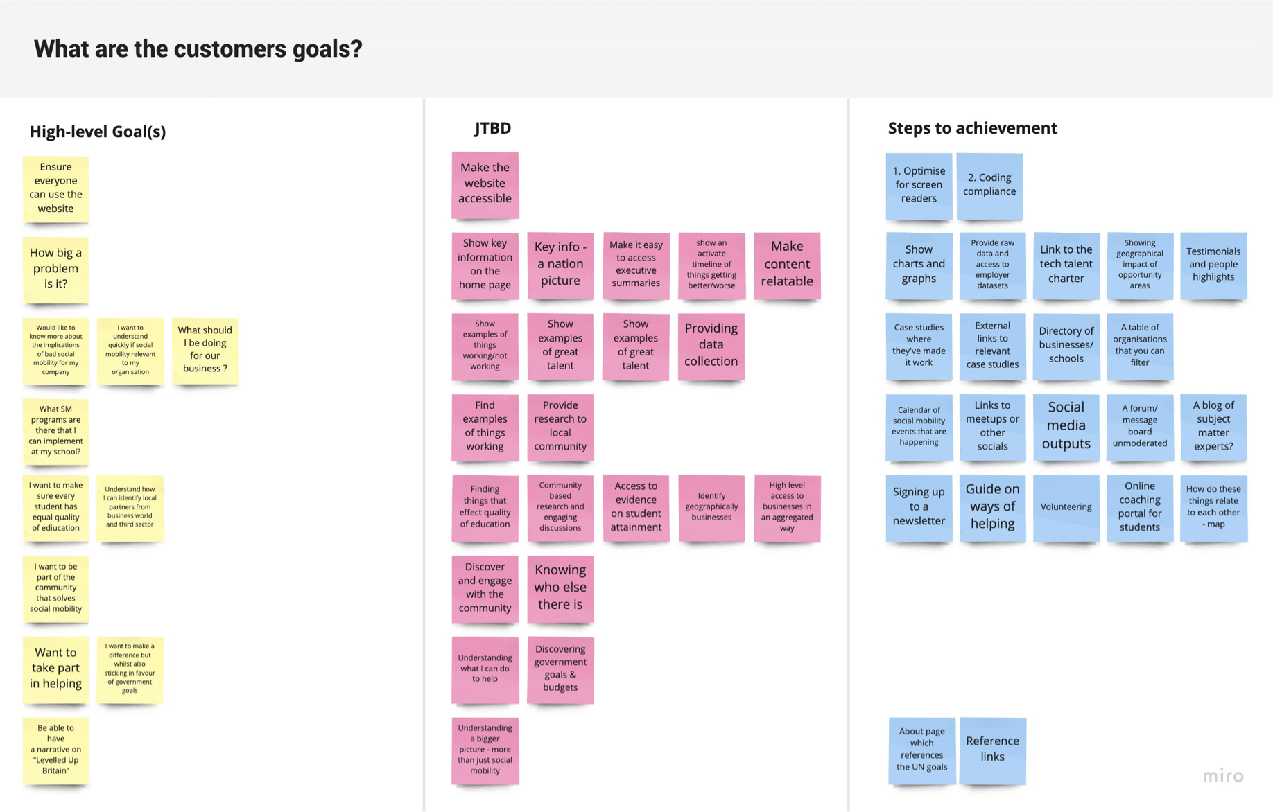
The main aim of the discovery was to:

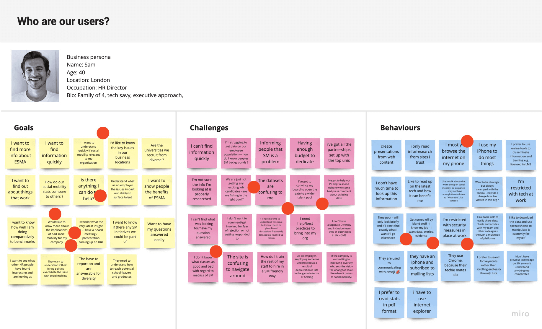
  • Find the target audience
  • Identify user pain points
  • Understand users behaviours
  • Find out from users their expectations of the platform
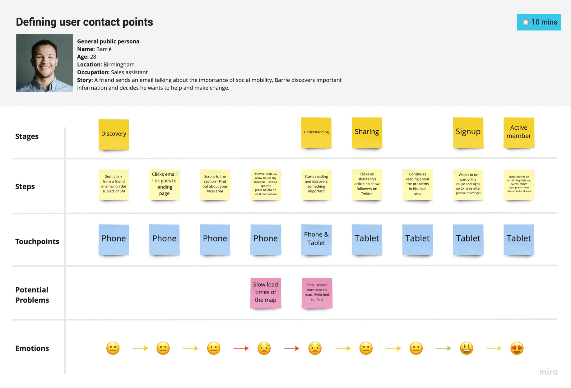
  • Define a typical journey the user would take
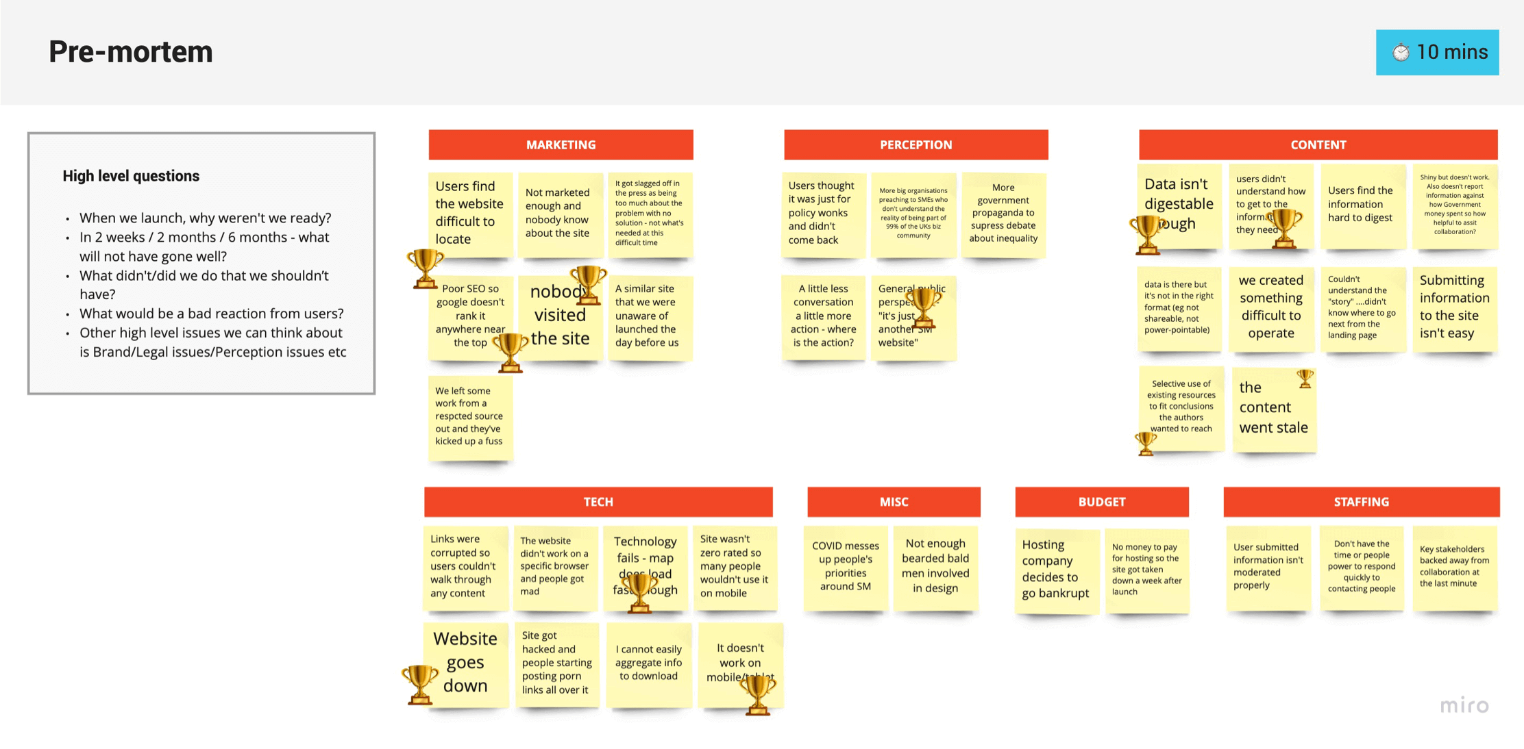
  • Outline the project risks and assumptions

Discover sessions

From the begging of the engagement, we knew that the stakeholders were time-poor, having only a few hours per day dedicated to the project. To complete some of the activities we had to set the client homework that we would pick back up the next day. These time constraints played into how we structured the discovery sessions and how we managed our time. Due to the project being remote we educated the client on how to use Miro, as this would be our main tool of choice for all sessions.

Kicking off the discovery sessions, we focused on a few different activities to involve the client as much as possible. Below I’ve gone through each of the activities we ran and outlined our findings:

Mission statement

The mission statement exercise gave the client a chance to reflect on why they started the organisation and to boil down core values into just one sentence.

The first step was to ask 4 main questions:

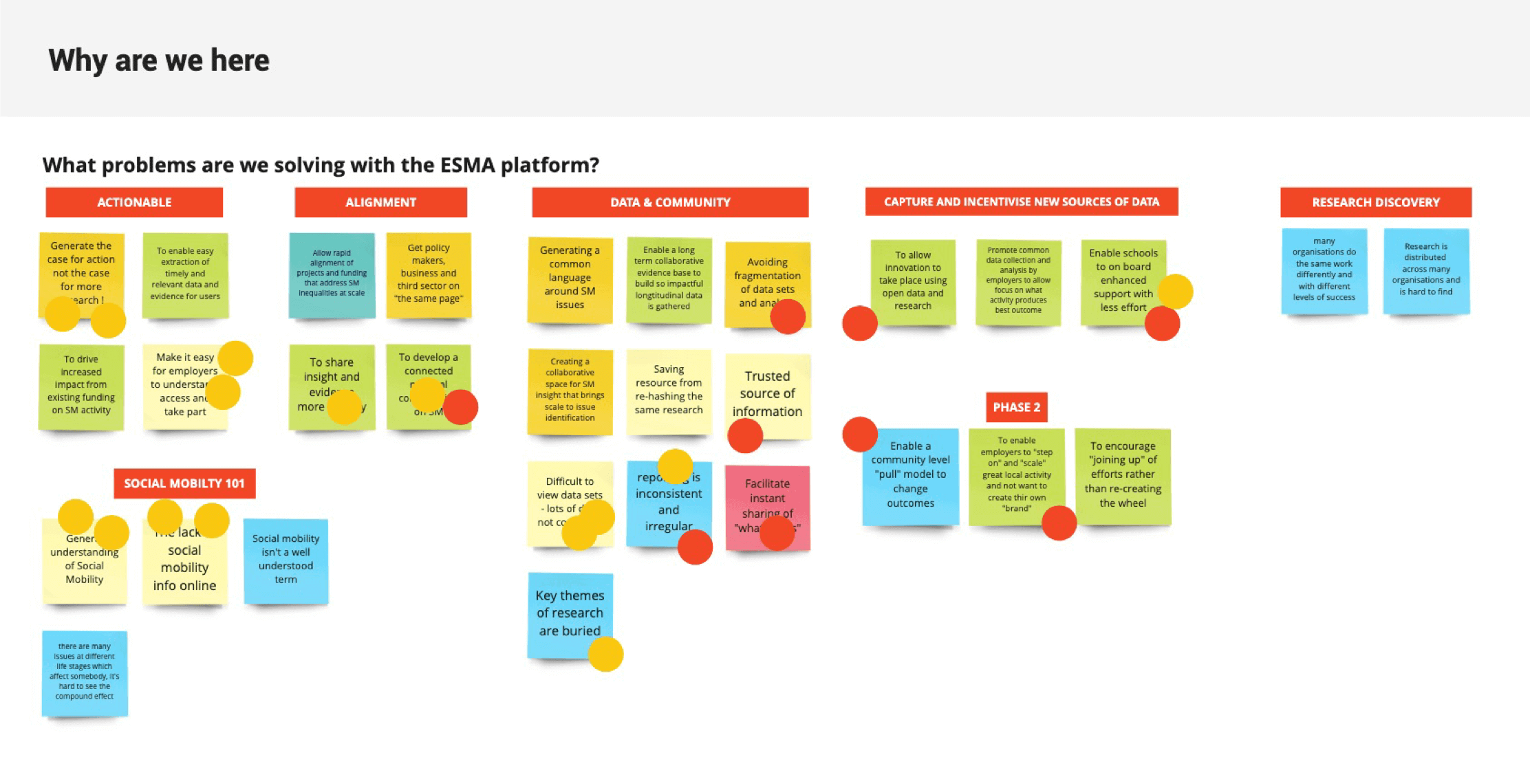
  • What problems are we solving with the website?
  • Who do we want to use the website?
  • What behaviours do we want to encourage?
  • What’s your motivation to work on the website?

After the client answered all the questions, we got them to dot vote on the most important answers, creating a heat map of the focus areas. The next step was to take all of the answers and combine them into one mission statement:

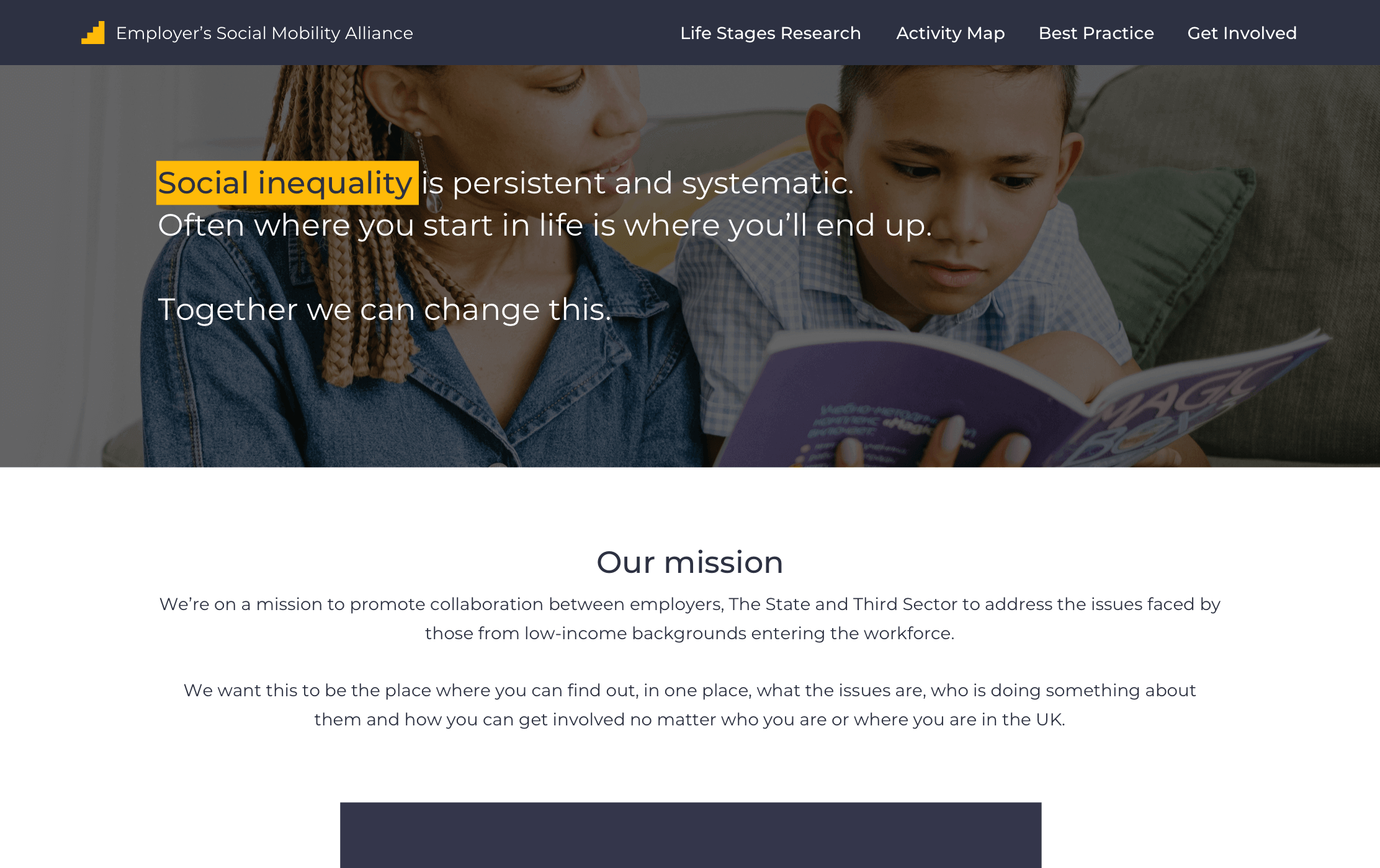
“To create a shared understanding of what Social Mobility is and how to improve it together”

Persona development

Next up, we wanted to flesh out the primary and secondary personas to inform our design decisions later on in the project. With a similar format as the Mission Statement, I mocked up a blank board template in Miro with a list of questions:

  • What are the user goals?
  • What are the user’s challenges?
  • What are the user’s behaviours?

These questions helped the client get into the mindset of the user and to think about how they might flow through the website. We settled on 4 main personas, all with very different use cases on how they would interact with the ESMA website.

Pre mortem

The pre mortem exercise helped enable us to work backward, to identify hypothetical situations, whereby the project could wrong.

A cluster of topics emerged after running the session. We identified as a team that Content, Tech, and Marketing are the most important risk factors.

Top tip: Using something like emojis (instead of dot voting) to vote, encourages everyone to take part and makes the activity more fun.

Jobs to be done

Taking the persona development one step further, we took all of the persona’s goals and mapped them to jobs to be done:

  • Goal: Ensure everyone can use the website
  • Job to be done: Make the website accessible

The final step was to identify the steps to achieve those goals. This got the client engaged and opened their eyes to the scale of the project and what would be involved to create a successful outcome.

High-level goal themes included:

  • Accessibility
  • Taking part
  • Perception

The jobs to be done for these particular themes included:

  • Making the website accessible for all types of user
  • Relatable content with key information at a glance
  • Geographical content

User journey mapping

After the personas were complete, it was time to define how the users would interact with the website. Getting into the mindset of the user, we addressed potential problems users face when completing their goals.

We started by thinking about the story behind each persona, mapping out how they would interact with the ESMA website, identifying their pain points, and similarly identifying areas of opportunity for us to create interesting and innovative designs.

Some interesting insights that came from journey mapping were:

  • Potential slow load times could deter users from the site
  • Smaller screen size optimisation
  • Article sharing
  • Search functionality

A (very short) Design Sprint

With our main discovery activities completed, we decided to run a very short design sprint to get a head start on the design phase. We ran 3 sessions over a couple of days, taking all the best bits from a week-long design sprint. I’ve outlined a quick overview of each of the activities we ran through and their impact:

Site structure

With everything we knew about the project, we focused on a quick site structure exercise.

  • The whole team placed post-its on the board, then as a group we clustered those post-its, identified where they should sit on the site, in turn, giving us a rough Information Architecture
  • We took the site structure and started talking about all of the features that may be included on each page

Lightning demos

We ran a lightning demo session to gain some UI/design inspiration. After capturing screenshots, we talked through our choices. We generally collected examples of sites that were information-heavy and captured specific UI that we could use in the wireframing phase.


3 step sketching

To ease the client into sketching ideas, we ran a 3 step sketch:

  • Notes & Ideas: Just simply doodling/writing out ideas
  • Crazy 8’s: Taking those ideas further into Crazy 8’s
  • Concept sketching: Creating one concept sketch for the homepage

After we each presented our sketches/ideas, we put them on Miro and dot voted for the most interesting parts. Taking the best of everyone's sketches we made a Frankenstein mockup. This was used as a base for the wireframes.

Wireframing

We decided as a team to use Figma to mock up wireframes as it allowed for easy collaboration. The main aim was to create a page that flows/reads well and caters to all of the persona’s needs.

During wire-framing we were able to work out the:

  • Main navigation
  • Header section
  • Sub content areas
  • Life cycle
  • Newsletter signup
  • Footer section

The outcome

We were successful in going through all discovery activities, running a short design sprint, and coming up with a design the client was happy with. We took the client on a journey and not only were they educated in the design process but could see value in our exercises and wanted to utilise these for future projects.

Lastly, the discovery findings were passed off to other members of Red-badger, they developed the core design of the site and ran user testing sessions. Before rolling off the project I developed a research strategy/framework, a rough guide for the UX designers taking over from me.

Final takeaways

Key learnings

  • Educating the client on design processes was empowering
  • Discovery phases are fast-paced and super fun
  • Getting the clients to buy in on our discovery process was super rewarding

What I'd do differently

  • I would do a intro session into design thinking with the stakeholders
  • All in all, I had a great time on the project and wouldn’t change it
Next project →

More projects...

Nando’s ID

Reworking login & sign up flows

Nando’s hackathon

A mini game whilst you wait

TAB Multiplier

Multipling your odds whilst betting online